CLASS 12-COMMERCE . ACCOUNTANCY . COMPUTERISED ACCOUNTING SYSTEM . GRAPHS AND-CHARTS-FOR-BUSINESS-DATA
Chapter 4 : Graphs And Charts For Business Data
Ch 4
ACCOUNTANCY
CLASS 12-COMMERCE
Learning Objectives
After studying this chapter, you will be able to:
- Represent data in graphical form in charts and diagrams through Excel.
- Use accounting data for graphical representation.
Introduction
In the previous chapter, you were introduced to the basic features of spreadsheet and use of spreadsheet in accounting. Often, data needs to be presented for effective communication of accounting information. Raw data may not be easily understandable. It is rightly said, “A picture is worth more than thousand words”. This chapter explains the method of preparing graphs, charts, and diagrams using Excel as a tool.
Graphs and Charts
A graph is a pictorial representation of data showing at least a two-dimensional relationship with X and Y axes. The X-axis is usually horizontal and the Y-axis vertical. Graphs can be single-line or multiple-line, with different lines and colors for clarity.
A pie chart represents multiple sub-groups of a single variable, while a bar diagram depicts two or more variables.
The following types of charts are commonly used to represent sales data of products:
- Bar Chart: Uses vertical bars to show sales for each product. Taller bars indicate higher sales.
- Single Line Graph: Connects sales values with a line across products to show trends.
- Pie Chart: Divides a circle into slices, each slice's size shows the proportion of sales per product.
- Area Chart: Similar to a line graph but the area under the line is filled to emphasize sales volume.
These charts visualize the same data in different ways to help understand and compare product sales.
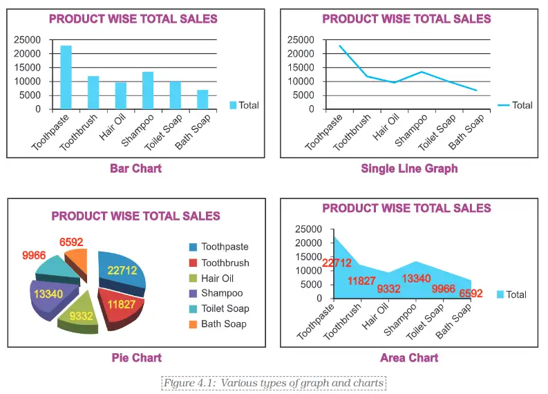
Figure 4.1 shows different types of graphs and charts which can be prepared with the help of commands or standard tools given in the toolbar.
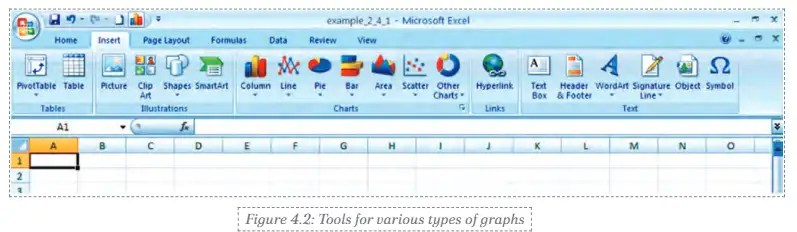
Steps to create charts in Microsoft Excel:
- Open Microsoft Excel and enter your data in a spreadsheet.
- Select the data you want to visualize.
- Go to the "Insert" tab on the toolbar.
- Choose the type of chart you want, such as column, line, pie, bar, area, or scatter.
- Click on the chosen chart icon to insert it into your worksheet.
- Customize the chart if needed, like adding titles or changing colors.
This tool helps you represent data visually for easier understanding.
Basic Steps for Graphs/Charts/Diagrams Using Excel
Step 1: Enter sales data for each quarter (QTR1 to QTR4) of the year 2007-08 for six different products manufactured by ABC Manufacturing Company Ltd. The worksheet includes row totals (quarter-wise total sales) and column totals (product-wise total sales), with the overall total sales in cell G11.
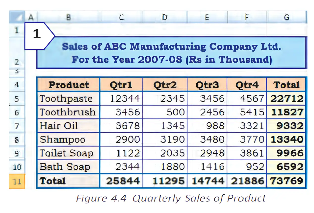
Step 2a: Select the product-wise total sales data and choose the chart type from the Ribbon to create a Bar Chart.
Step 2b: Similarly, reorganize data to prepare charts showing total sales for each quarter. Excel supports many chart types to display data meaningfully.
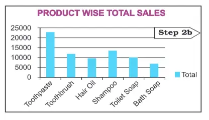
Bar chart showing total sales for different products helps compare sales easily.
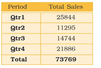
Sales summary table for four quarters shows sales totals and overall total sales for the year.
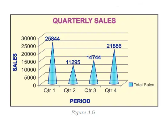
3D bar graph of quarterly sales visually shows sales trends across quarters.
Elements of a Chart/Graph
A chart or graph is a pictorial presentation of data. The basic elements include:
- Chart Area: The entire chart including all elements.
- Plot Area: The area bounded by axes where data is plotted.
- Data Points: Individual values plotted, represented by bars, lines, pie slices, etc. Data points of the same color form a data series identified by the legend.
- Horizontal (Category) and Vertical (Value) Axis: X-axis contains categories (independent values), Y-axis contains data (dependent values).
- Legend: Identifies data series or categories in the chart.
- Chart and Axes Titles: Descriptive text for the chart and axes.
- Data Labels: Additional information about data points.
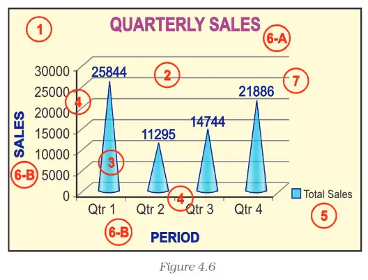
Some elements are displayed by default; others can be added or formatted as needed.
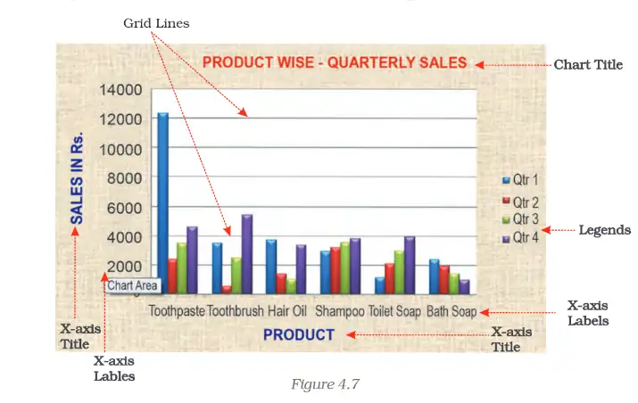
Example of a labeled bar chart showing product-wise quarterly sales with legend and gridlines for clarity.
Formatting of Chart
Using the Design option, you can change the look of a chart including chart type, layouts, and styles. The Chart Tools add Design, Layout, and Format tabs for customization.
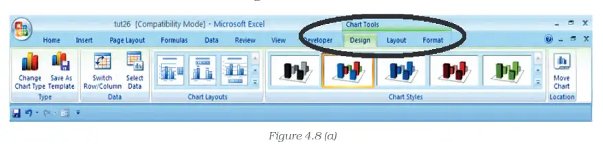
Steps to format chart elements:
- Click anywhere in the chart to display Chart Tools.
- Use the Design tab to change chart type, layout, and style.
- Use the Format tab to select and format specific chart elements.
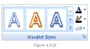
Options include changing shape styles, fills, outlines, effects, and text formatting using WordArt styles.

Format tab allows changing colors, borders, effects, and arranging chart elements.
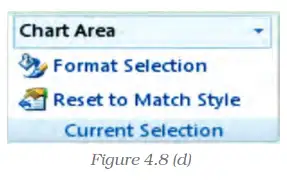
Format Selection dialog box provides detailed formatting options for selected chart elements.
Changing the Shape Style
On the Format tab, in the Shape Styles group, you can:
- View all available shape styles.
- Apply pre-defined shape styles.
- Change shape fill color, remove fill, or use custom colors.
- Fill shapes with pictures, gradients, or textures.
Similarly, you can change the shape outline color, remove outline, adjust weight (thickness), use dashed lines, and add arrows.
Shape effects like preset, reflection, and bevel can be applied depending on the chart element.
Changing the Text Format
Text in chart elements can be formatted using regular text options or WordArt styles.
- Click the chart element containing the text.
- Use the Mini toolbar or Home tab font group to apply formatting.
- WordArt styles allow special effects like color, outline, shadow, 3-D format, and rotation.
Format Text Effects window allows changing text fill, outline, shadow, transparency, and other effects.
Changing the Layout of the Chart Element
The Layout tab in Excel provides options to customize chart elements such as titles, legends, data labels, gridlines, and background elements.

Steps to customize layout:
- Open Excel and create a chart.
- Click the Layout tab to access formatting tools.
- Use options like Picture Shapes, Text Box, Chart Title, Axis Titles, Legend, Data Labels, and Data Table.
- Adjust axes and gridlines for readability.
- Add or modify background elements.
- Use analysis tools like Trendline and Error Bars for advanced visualization.
Changing the Chart Type
A chart can be changed to another type to better suit the data presentation. For example, a bar chart can be changed to a pie chart to show proportions.
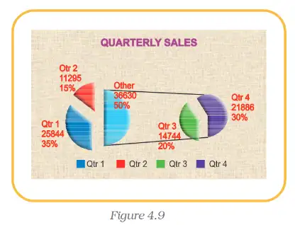
Steps to create a Pie Chart:
- Enter data in a worksheet.
- Select data from two consecutive columns.
- Select Pie chart type from the ribbon.
- Choose 3-D Pie option.
- Use Chart Tools to customize design, layout, and format.
- Apply bevel and shadow effects for 3-D appearance.
- Rotate the chart for better perspective.
- Use themes to change colors and styles.
Note: Pie charts can only plot up to seven categories with positive, non-zero data values.
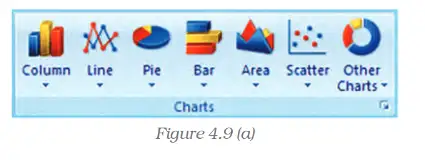
Menu of different chart types available in Excel includes Column, Line, Pie, Bar, Area, Scatter, and others.
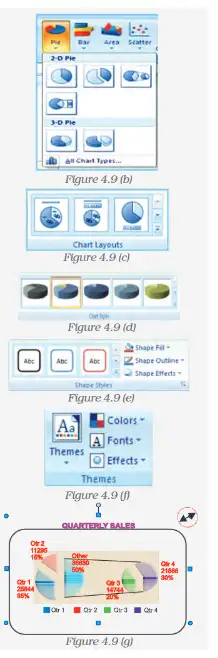
Example of chart customization options and a finished pie chart showing quarterly sales.
Resizing of Chart/Graph
Resizing changes the size of the chart or its elements. To resize:
- Select the chart by clicking it.
- Move the cursor to the corners or edges until it changes to a two-headed arrow.
- Click and drag to resize as desired.
2D and 3D Charts/Graphs
Graphs are usually plotted in two dimensions (X and Y axes). The X-axis contains categories (independent variables) and the Y-axis contains data (dependent variables).
Sometimes, three-dimensional (3-D) charts are used, adding a depth axis (Z-axis) to represent additional data series.
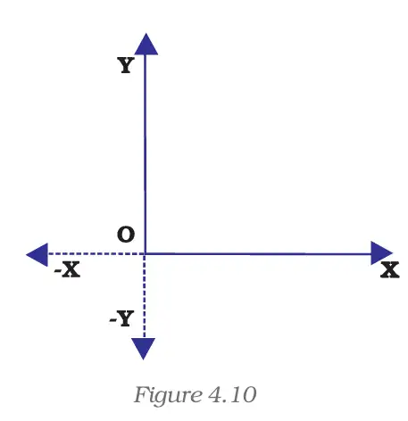
2D Cartesian coordinate system with X and Y axes intersecting at origin (O).
Negative values can be plotted on the opposite side of the origin on both axes, useful for data like profit (positive) and loss (negative).
Common 2-D chart types include line graphs, bar charts, area charts, column charts, radar charts, and scatter charts.
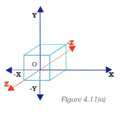
3D Cartesian coordinate system showing original and rotated axes.
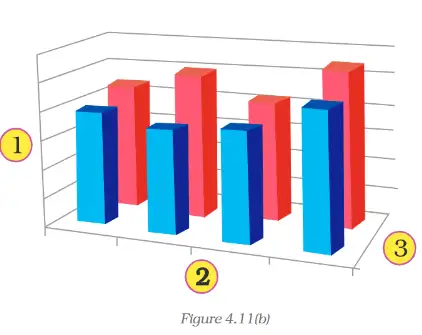
3D bar chart comparing two groups of data across categories.
Example: To represent volume, three parameters are needed: height (Y-axis), length (X-axis), and breadth (Z-axis).
- Vertical (derived value) axis (Y-axis)
- Horizontal (category) axis (X-axis)
- Depth (series) axis (Z-axis)
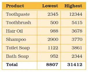
Table showing lowest and highest sales values for six products, useful for comparison.
Radar and Doughnut Charts
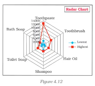
Radar charts compare aggregate values of multiple data series without horizontal or vertical axes.
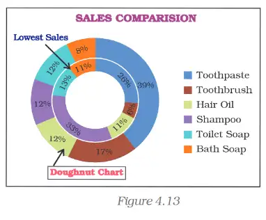
Doughnut charts show relationships of parts to a whole and can contain more than one data series. They are rings representing data series.
Doughnut chart subtypes include:
- Doughnut: Displays data in rings, each ring a data series.
- Exploded Doughnut: Emphasizes individual values while showing contribution to total.
Advantages of Using Graphs/Charts
- Help to Explore: Quickly identify relationships between variables, such as GNP and infant mortality rate.
- Help to Present: Provide information quickly and clearly, as used by newspapers and magazines.
- Help to Convince: Graphs can persuade by visually summarizing large amounts of data.
Summary
- A graph is a pictorial representation of data, usually 2-dimensional, sometimes 3-dimensional.
- Graphs can be single-line or multi-line, distinguished by line shapes or colors.
- Popular pictorial representations include Pie Charts (show relative shares) and Bar Charts (compare absolute values).
- MS-Excel provides convenient tools to draw graphs and charts with elements like Chart Area, Plot Area, Data Points, Axes, Legend, Titles, and Data Labels.
- All chart elements can be formatted using Design, Layout, and Format options in Excel.
- Chart size can be changed as needed.
- Chart types can be changed to better visualize data.
- Graphs and charts help visualize trends and make complex data easier to understand.
Steps to Prepare a Chart
- Enter data in a worksheet with proper column and row titles.
- Create a basic chart using the Chart group options on the worksheet ribbon.
- Change the layout or style of the chart by applying predefined layouts and styles, and modifying chart elements.
- Add or remove titles and data labels as needed.
- Show or hide legends.
- Display or hide chart axes or gridlines.
- Move or resize the chart.
- Save the chart.